Do you want to learn the interior designers' workshop? What inspires them, where do ideas for the decor come from? We invite you to read the interview with Ania Branicka and Marta Trzebicka from the Design Anatomy studio

We are very committed to ensuring that every person who entrusted us to arrange their area receives a unique product of exceptional quality. The name of our studio, Design Anatomy, is also our business philosophy. The analysis of each individual element and its importance for
 the functioning of the whole structure enables us to choose appropriate means of narrative and architectural solutions that are often unconventional but they always match users’ profiles and their current needs. This requires exceptional involvement from us but we are appreciated for it, so it gets us going. It’s impossible to name projects we are the proudest of because we put our heart and soul in every undertaking.
As for awards, the most fruitful year was 2019 because then Design Anatomy received 3 awards thanks to the support of Olivia Business Centre residents. In the 3rd edition of OFFICE SUPERSTAR competition, Nordea branch in Gdańsk was one the prize-winners in the category “The best office in TriCity”, while SII company gained a distinction. SII offices, in which you can find two slides and a 7-metre climbing wall, were considered to be the best recreational area in Poland. It’s for sure something to be proud of because, as we know, the needs on wellbeing of young generation employees continue to grow. We wouldn’t have achieved these successes without Investors’ trust that is why our success is not only the area itself but also the relations created while designing; the relations that let us grow.
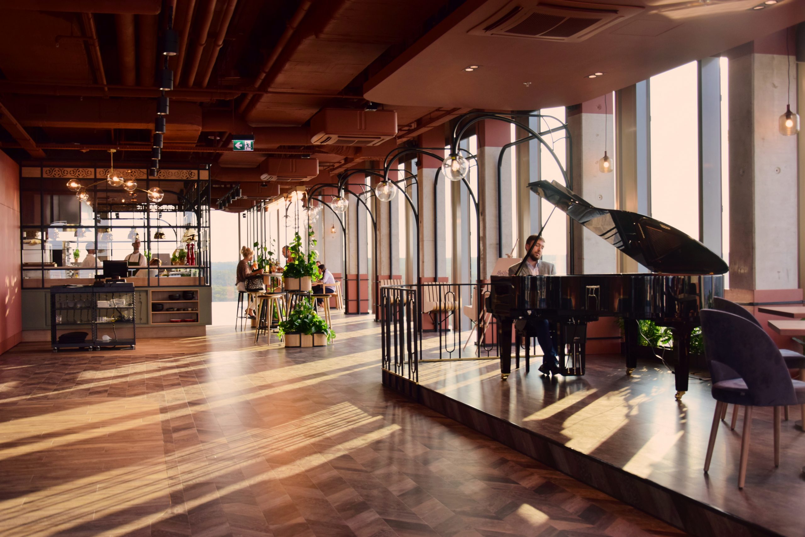
In 2019 we arranged TOP STAR areas located in the highest building in Pomerania –Olivia Star – we realized a project of a conference centre on the 34th floor and cooperated with a Spanish studio, the author of the concept for a restaurant on the 33rd floor. Designing the observation deck on the 32nd floor was the most memorable work. It was like creating a beautiful history for everyone who wants to visit this place. We made it – all these places are often visited and guests feel good there. We are particularly glad to hear such kind words because they come from people of different ages and tastes, from residents, heads of corporations and foreign guests.
The idea around “@Home” is especially dear to all of us. We asked ourselves what makes us feel at home? We weren’t looking for the answer in the field of design but in the field of “wellbeing” in its broad sense; that is building interpersonal relationships and your own welfare.

Our activities were wide-reaching – surveys, research, consulting suggestions with co-workers, OBC residents, young people, presentations, visualisations. It was a lengthy process. Different slogans were raised: snug, cosy place for relaxation, meetings with friends, playing board games, watching films together, nature, garden, greenery, animals, warmth, light, comfort, functionality. If we wanted to describe it with one word, that would be Hygge understood as cosiness, blissfulness, the comfort of being with ourselves and other people. Within the meaning of interior design, it translates into well-designed area that combines aesthetics and functionality in the vein of Scandinavian style based on the natural, ecological materials and solutions.
For every person who appreciates a homely atmosphere, high-quality materials and timeless design. Technological solutions used in the building ensure acoustic parameters of the walls, large windowpanes and suitable lighting od each room.
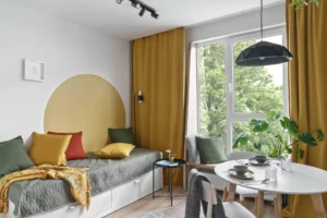
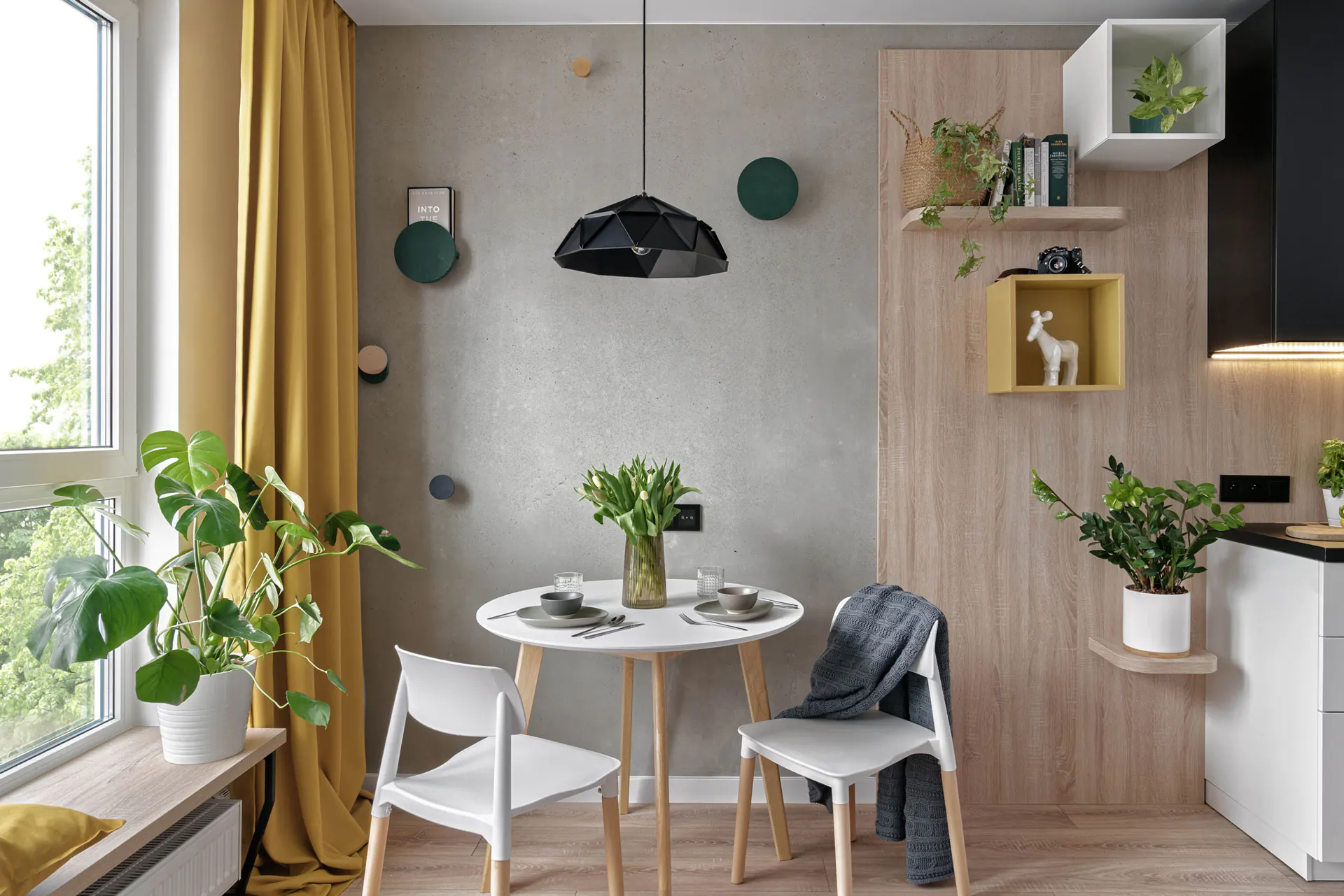
We designed ergonomic kitchenettes and bathrooms, as well as appropriate storage area, and diversified lighting. Considering opinions of our respondents, we decided on timeless and invariably popular material solutions. Floors and parts of linings in a warm wood colour were matched against natural concrete and white walls. Thanks to that they are a natural background that was completed by soft, colourful fabrics, creating space with exceptionally homely atmosphere.
We paid a lot of attention to relaxation areas. We provided comfortable beds and additional curtains that make this area more intimate. Large windows inspired us to design wide windowsills in the form of seats with cushions that enable you to relax with a beautiful view during the day. These large windows also provide us with natural light that supports our vitality. In the evenings it’s an ideal place for relaxation with a book or chatting with your friends with a cup of tea by warm lamplight.
Apart from a private area inside apartments, we created conditions for people willing to build an active and supportive community in a common area. We scanned the whole building and searched for every square metre of common areas to help arrange additional space for integration. We managed to find such areas both in the building and on the open-access terrace and in the garden.
We wanted to refer to the unique creativity and energy characteristic of Zaspa. Fitting into Seikon’s creations that pour into the building’s interior, we focused on freedom and creative chill, leaving room for activities initiated by residents themselves.